
a product review of choice kingdom trust
I started using Choice by Kingdom Trust along with Casa in order to buy digital assets for my retirement accounts.
I wanted to document my experience and bring to light that crypto and web3 still have huge strides in making a smoother user experience. I expected much more clarity with regards to fee structure and also movement of assets. It was months of me asking questions prior to comitting and I was still unaware of several hundred dollars in fees.
The setup I used was the "hold your own keys" (HYOK) method, where one would hold their own private keys using a multi-signature Casa setup. Any digital assets purchased would be assigned into an investment trust that Choice helps you set up, and you would hold the private keys (access) to your own coin on Casa.
We'll start with a summary of the fee structure. I won't delve too long here, since the main part of my post is really about the user experience.
fee structure & paperwork
The obvious costs are the initial setup fees for Casa, for a Safeguard Advisors investment trust, and a flat percentage cut for every digital asset trade made. There's a $500 setup fee if you decide to go with the HYOK experience. The Safeguard trust is then billed monthly from there on out, about $10 bucks a month. Casa renewal fees occur yearly at $120.
Now, to some of the lesser known fees. If you set something up like a solo 401k (like what I did), there's an additional $75 initial setup fee with the solo 401k provider, as well as a recurring $365 annual fee for bookkeeping. That's from the administrator of your solo 401k plan.
From Choice, let's say you buy 1 BTC for your retirement savings. You have to move that 1 BTC into your investment trust, otherwise for every day that that 1 BTC sits in Choice's cold storage and not in your trust, it incurs a 1% annual fee. So, for every day it sits with Choice, it's 0.01 / 365 * 1 BTC that they're charging you. The transfer is not instant, and it takes paperwork; THREE paper forms per asset movement into your trust. Multiples of three if you want to make sure you're separating Roth employee and employer elective deferrals from your LLC. On top of these three forms that you have to fill out, they need a picture of your Casa wallet address, a copy paste .txt of your address, and a picture of you, your ID, and a written statement. This again, is for every asset movement into your trust.
So far, I haven't seen them move my assets into my trust faster than in a week. They also have to call you and have voice confirmation that you want to move your assets to your trust. So really, you're losing a couple of dollars every day for a week, and longer, if for some reason you keep missing their call. I even asked if they would consider product changes to cover that kind of loophole ("no, not a this time"). Maybe it's something about moving things into trusts and the limits of KYC that I don't fully understand. 🤷🏻♀️ In the large scheme of things, sure, it's not that bad. But still, it's a small, slow bleed that just bites at me a little bit, especially if you don't figure it out as soon as possible, and especially because cryptocurrency and blockchain is all about making trust just a bit easier.
Also, all of the communications and form transfers are conducted through email and email attachments. I have tens of emails and email attachments everywhere, which to me, is just an operational nightmare.
There's another two forms that you have to send to your solo 401k provider noting that you made digital asset purchases as well. For one of these forms, the information is not accessible through the Choice web app, and you have to reach out to them personally through email to get your hands on it. This becomes really cumbersome, even if you're doing infrequent trades.
I'll also mention that none of these instructions are obviously written anywhere on Choice's site, and the forms to submit aren't exactly in one, readily available place. I was sent 2-3 versions of the same form sometimes, and all of them were different. What gives?
So with all the fees and time expended filling out forms, am I really coming out on top? I don't really know. If you believe in the future of blockchain and digital assets, sure, maybe. But fees on fees and a less than white glove experience definitely has gotten me frustrated. I understand that there's a tradeoff between speed, trust, and security, but some parts of this experience really need some automation and improvement.
web user experience
Let's move onto the actual user experience of the web application.
If you've just opened an account, the "current application status" is ridiculously confusing. I understand that I've created an account and finished my application - the completed steps don't need to be shown inside my created account. The only useful part of showing this is that the "fund account" is the main call to action, and it helps me get there.
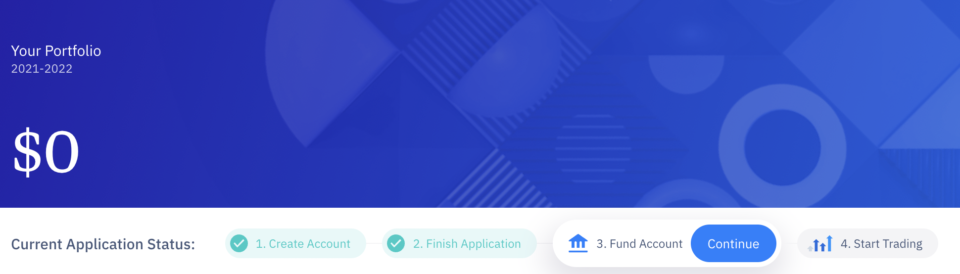
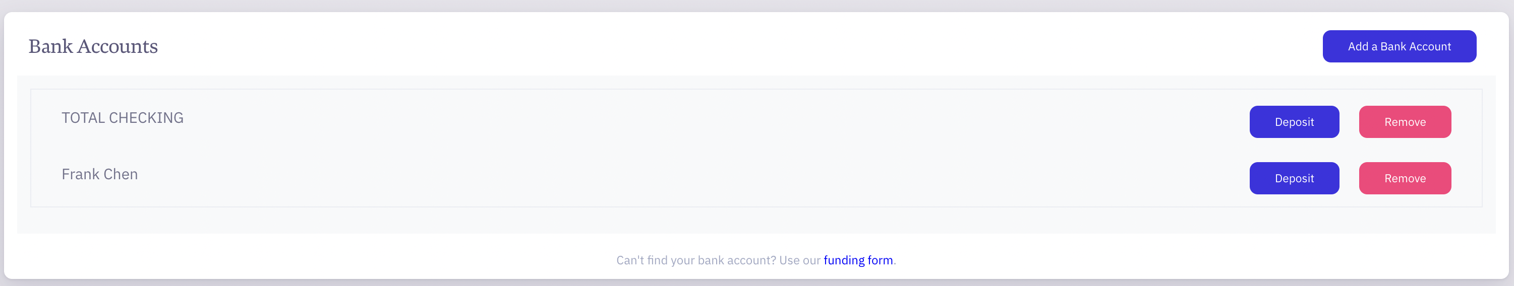
Once you've funded your account and traded once, the current application status disappears. There's no "fund account" call to action, aside from going to the profile menu and adding your bank account. After adding your bank account, you actually have to hit "deposit" to add funds to your retirement account, which is counterintuitive - "am I depositing to my bank account (no), or my retirement account (yes)?"
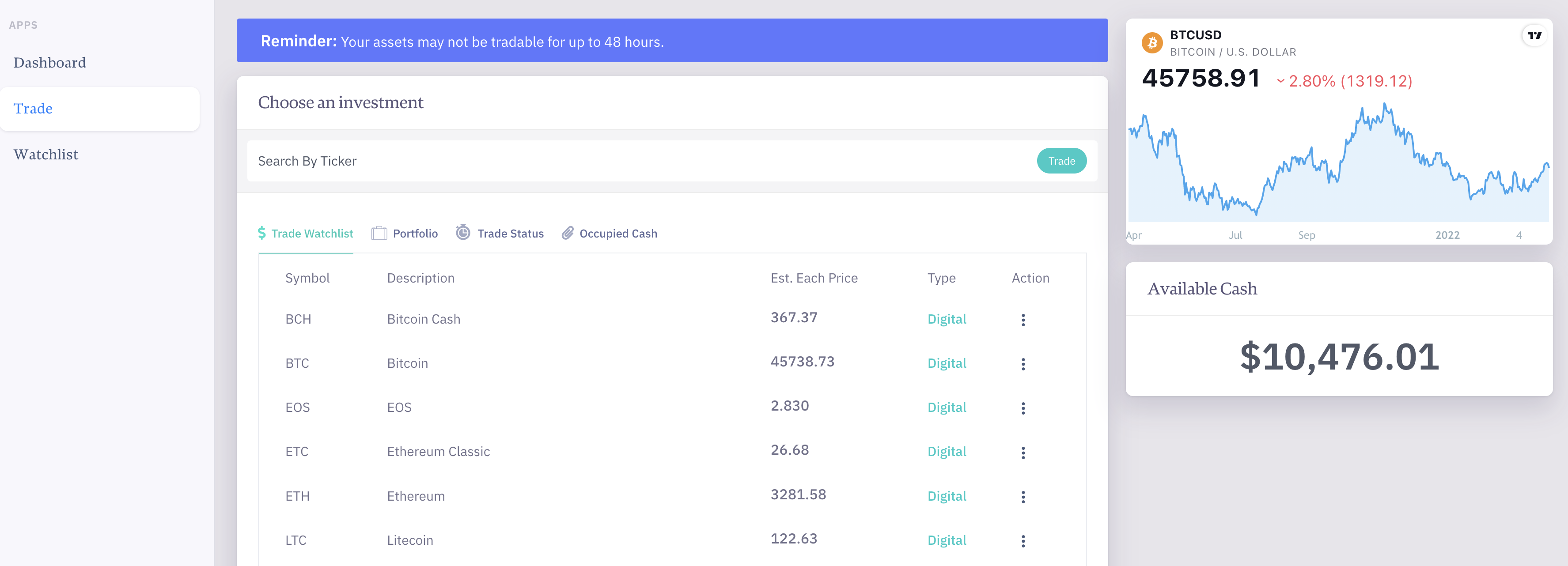
There is duplication on the sidebar and also the tabs found on the main page. I don't need to see my watchlist in the sidebar, on the main page under a hard to see tab, AND as a tab in the trade section. That's three instances of watchlist, a feature I don't even use. Since Casa HYOK only supports one digital asset, I'm not really looking at much of anything else. Here, I would just show my portfolio, my pending transactions, and pending movements into my trust. If they're going to keep doing this whole crazy paperwork fiasco, I want this information up front and center, so filling out forms is easy.
The portfolio tab is also duplicated across the dashboard and the trade sections, which is unnecessary. Between the sidebar, dashboard, trade, and watchlist, there are plenty of duplications to unravel for a much more compact and concise user journey.
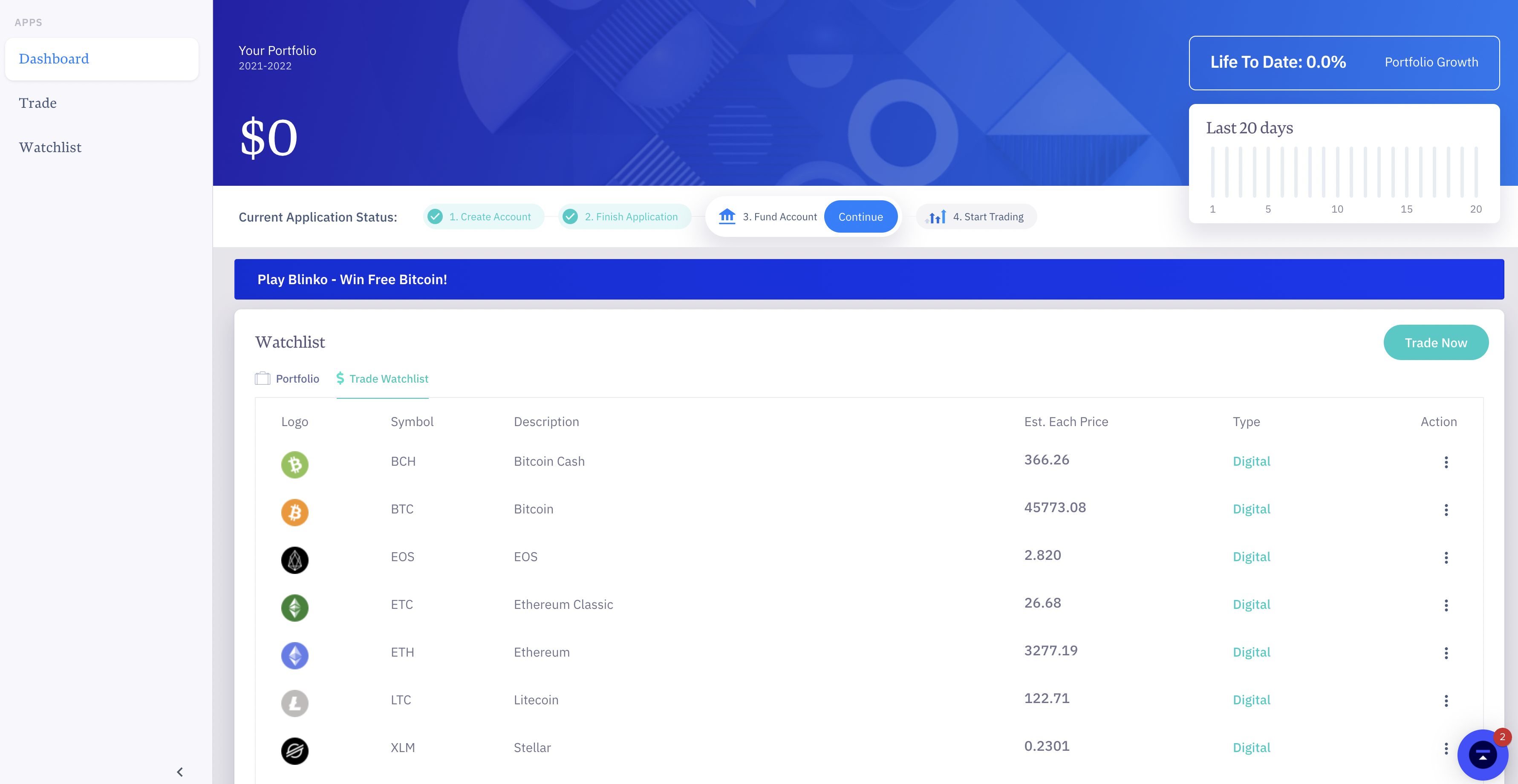
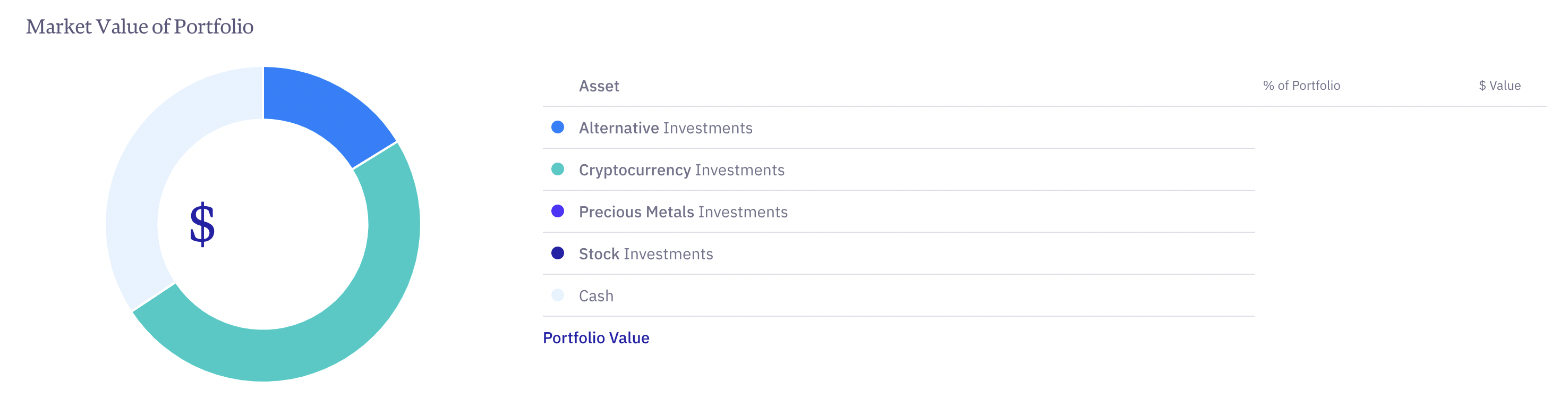
The market value of my portfolio is kind of nice, but pie charts in general suck, since humans can't tell "area" differences very well with their eyes. There might be some consolidation between "portfolio" and "market value of portfolio", showing both general information like asset class, and specific information (e.g which asset, cost basis, market value, asset storage location).
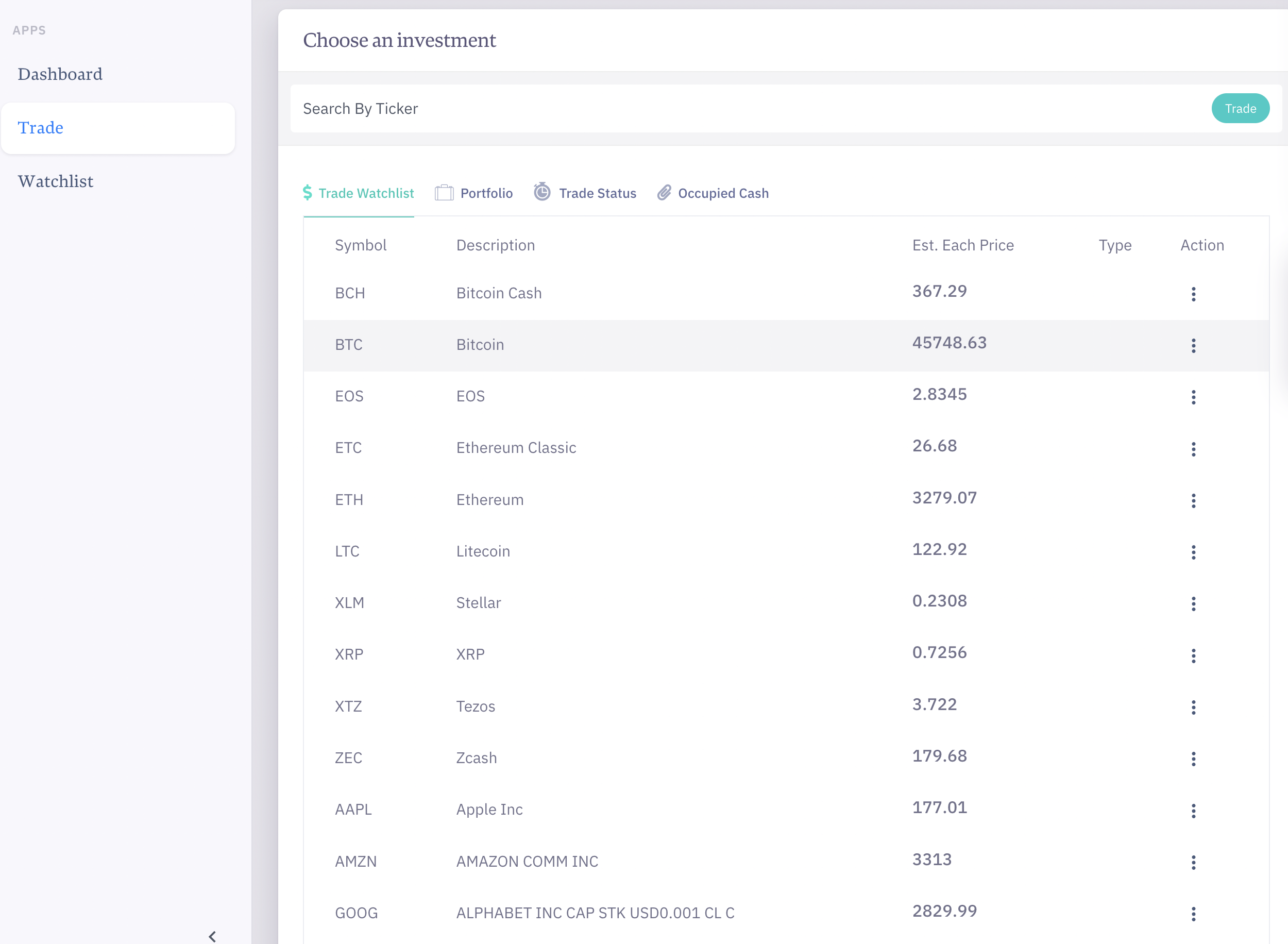
Under the trade tab, the tab system is easily missed here. I actually didn't see portfolio, trade status, and occupied cash at all. I also can't customize the right hand side bar. Not that necessarily want to, but just seeing the BTC ticker is kind of random. I expected to be able to add widgets for customization, but none of this was available.
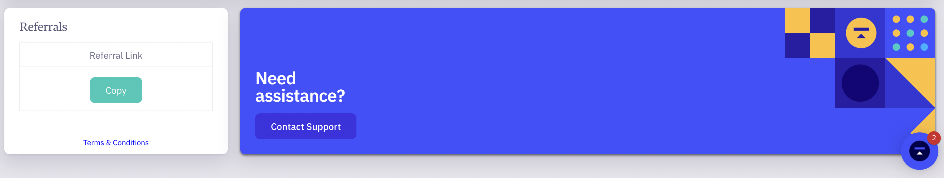
Referral links are basically hidden at the bottom, and to me, are taking up valuable real estate for other main parts of the product. Put the referral links in the me menu, and use it smartly in a marketing campaign.
You don't need this oamount of space to contact support, there's already a chat button in the lower right hand corner.
In general, the layout just seems randomly thrown together, and it doesn't inspire me to take the correct action. It's taken more than 10-20 clicks to figure out what I'm looking at and to get at the information that I need.
summary
- There are initial setup fees involved.
- There are monthly and annual fees involved from both the IRA provider (Choice) and the retirement plan provider (a solo 401k specific case).
- There are asset movement fees incurred if you don't move your assets.
- Some of these fees are not obvious. I hope this post can change that.
- Some of the visual dashboards on Choice's web product could be de-duplicated.
- Some user actions on Choice's web product could be made more clear to promote information access and defined user call-to-actions.
While this post seems critical, I'm still using Choice's services for now, as their customer support system is quite responsive, but the user experience is frustrating to a point where I may reconsider. I will continually reassess and update my opinion here as it changes.
back to map of content (product)